Urban Outfitters: Color Outside the Line
Campaign Design
For Urban Outfitters, I have formulated a campaign that promotes their brand identity for home and also encourages people of every age/profession to buy from their furniture line.
What problem am I trying to solve?
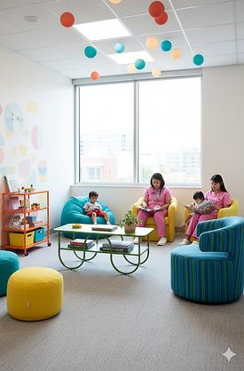
Hospitals, offices, schools, libraries are all public spaces that look the same everywhere. We can easily imagine what these places would look like anywhere. Similar lighting, same furniture, color palette and atmosphere. It's all sad, white and serious. Urban Outfitters is trying to change the mindset that specific places need to look certain ways or boxed in a particular way. They are promoting design choices that feel homey, lively and warm instead of cold and into decisions. It also fights against gender roles hence, advertising crossing lines and coloring outside of them.
Taglines:
Color outside the line.
There IS a place like home.
Turn every space into the vibe you crave.
Make anywhere a place like home.
Feels like home, wherever you go.
What it means for the campaign?
Digital assets for social but also we use pop ups and immersive experiences to show what it looks and feels like not just on paper but in real as well. We place products from different categories (seating, lamps, desks, storage) in hospitals and school waiting areas or office spaces to show that décor, color and fun have no age or profession. It's for everyone and everywhere. The possibilities would be endless but let's look take a glimpse of it.
I have used AI to generate only the following few images using products from the official Urban Outfitters website as inspiration. This helps us visualize what the campaign would look like as an immersive real time experience.
*Digital asset product and imagery © Urban Outfitters